>> Theme Team asks: Toolbar Icons - what's missing?
Over the past couple of months the Team has been engaged in the herculean task of preparing for the custom toolbar icon set. This has not just been an effort in creating the icons themselves, but also the underlying principles by which we will operate and which road of compromise we will take at each fork of the numerous contradictory requirements we face. We've done a lot of work here, and in return ask that you read all this guff, to understand where we're coming from:
No Meanings : There are an almost infinite number of possible actions, but we need to keep the icon count manageable and non-bloaty. Icons without accompanying text are valuable only when the meaning assigned is parsed by the user, and in this case it is the user who is doing the assigning. So; the icons are an aide-mémoire for the user. If the icon means something to you, and you assign it accordingly, that should stick in your memory, provided you have found a suitable icon. Therefore, we do not assign meanings to our icons, and a little ambiguity in an icon is actually a benefit if it increases the flexibility with which that icon can be used. This is best exemplified, I believe, by the number of requests we've had for the return of the 'silly' icons from V3 - people seem to find them very easy to assign and then recall meanings. OK, no problem.
.
Colour : The experience from doing icons sets for the V3 theme has been extremely valuable in underlining that trying to cover all the possible actions with just shape severely limits the success of each, as the number increases. So we have decided we need to use colour, and yes sadly that does mean that some icons will be unsuited to some people with some forms of colour blindness, who may need to rely on other icon sets, text buttons, or tooltips. We have devised a 'colour language' for which colours are used when, and the testing so far indicates people do seem to pick it up without thought or explanation, to a pleasing degree of success.
.
Styling : Its important to have as even as possible degree of 'eye catching' across all icons. Remember, if one thing catches your eye, it is to the detriment of other things. This applies not only across the icon set, but also in relation to the rest of the interface. We've worked very hard on this styling, and it does seem the best set of compromises - its testing well, better than I could have hoped for. If you don't like it, sorry, but this is one job the where the possibility of pleasing everyone is even less realistic than usual.
.
Text : Ideally, icons are supposed to have accompany text, but we only have tooltips. This is OK, its a space win, but it does mean that any text we do use is going to be an eye mugger. So, if at all possible, we avoid using any text within an icon.
.
Text Buttons : If the best way to do an action is with a text button (within the constraints they have) then we leave it for that.
.
Portability : We have been very mindful that whatever we do needs to be as effortless and flexible as possible for themers to merge into their designs, which may be very different.
We have thought long and hard about these, and made our compromise decisions, so we're not looking for any further discussion of them. Sorry, but we need to make forward progress, and sometimes that means making a decision.
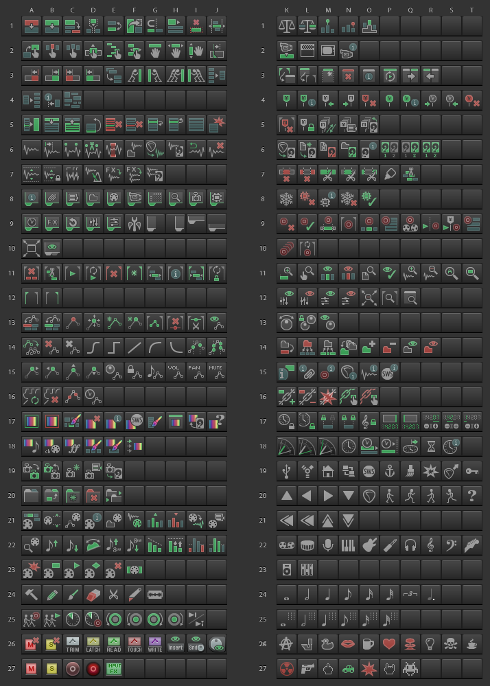
Here are the icons we have so far:
This is the question....
What common action, or custom action, cannot be successfully represented by one of these icons, or a text button?
Your answers please We're not going to hit them all, but we want to hit a lot.
Please, nothing unrelated to the question. Last time we tried this consultation it didn't work out clearly, and so the custom toolbar icon set lacked the required depth of thought and so was far from optimal, to the detriment of all users. So, by posting in this thread, you hereby give me or another mod the right to prune your post and you not get angry about it ...just for this thread.
Looking great! Lots of stuff in there I've been wanting for a while but never actually requested (are you guys mind readers? )
Music notes would be good, I think. Whole, 1/2, 1/4, 1/8, 1/16. Maybe another set with a "t" after the notes for triplets? They'd work great for setting grid spacing at a glance.
Awesome job mate. I hope the default theme is pushed more towards this sort of colour scheme, looks great.
For actions...what about some of the new midi functionality? I don't know alot about actions but with the new ways of opening the Piano roll plus midi tools there may be a couple. I see a few sort of related ones in there though...
One of them I need to criticize, and it's the Write Automation mode 23G. WRITE is the most destructive and dangerous mode, and for good reason it is highlighted immensely in other systems. Some systems even do without it. That icon is way too harmless, and purple is a colour I would not take seriously in the context. The best I've encountered in a DAW is the Protools description of a fully red background beneath white text. Boom. We're being destructive. Warning. Hope you know what you're doing.
I like the detail in many of the icons. What this collection does not show is how they might be arranged by the user.
Take the icons 13A - 13D, which could be used to push envelope points around in all four directions. The way they're arranged in this showcase is of course not beneficial. They're hard to spot, and the detail rather hurts them, but if you arrange them in a cross
Code:
 |
- -
 |
they become easy to recognize and use. In many cases it is simply a question of designing the arrangement of these icons to best suit their purpose.
It's a fine set to work with, much better than what we had before, IMHO of course.
fantastic work Mr.Tie...
[note to 'some people'... if YOU have ever made your own icons, you will better appreciate how well done this set is!]
I do agree that a full set of 'somethings' for grid settings can be very handy... personally I used note symbols at first but then went back to fraction numbers along with a little grid symbol and then also added the few multipliers and dividers actions...
I use them in a floater and also in the midi ed. Now that we can have so many floaters, they are handy.
A thought that might help this overall question:
If users could have a description of what each of those icons is intended for, it might be helpful...
I also have icons for env. shapes in two ways:
1- set selected points to shape [linear, bezier, etc.]
2- same icons but with a D in red, meaning make that the default shape for the whole env.
maybe these are there but I don't see them for default shape
lucky_bleeder, metronome is in the standard toolbar like undo-redo,grid etc.
set cant cover whole the actions list so you need to turn your imagination sometimes to link visually -
personally for some actions i can choose even several icons that somehow imo will refer this action. and rest is just a habit
thanks White Tie!
Great work!
Maybe i haven't seen the icon which was probably meant for that purpose if there is one at all...
I often normalize recorded takes to make them more comparable.
So i use a Xenakios/SWS action "Normalize selected takes to db value..." or just Normalize.
Currently i'm using 5A.
I've looked long and hard but I don't see a penis icon. And you call this a professional DAW?
pfff.
[Nice work, btw]
__________________
Success is just one more plugin away! And happiness is as close as your next upgrade. (On the interweb: www.rolandk.ca / www.auroraskypublishing.com)
I would like to suggest automation modes for all tracks and global overrides, though Reaper range of functionality of toolbar buttons could be expanded to include things like :
Double-click a button (I'd place automation modes for ALL tracks here)
MIddle-click a button (I'd place global overrides here. Same mode twice to turn off global modes).
But since that probably won't happen, I would love to have
ALL tracks mode buttons
global overrides and global override off
hide all envelopes(maybe I just haven't found that in the list yet)
__________________
Success is just one more plugin away! And happiness is as close as your next upgrade. (On the interweb: www.rolandk.ca / www.auroraskypublishing.com)
I'd continuously click that one during vocal tuning. It should do something soothing like start a screensaver that plays an episode of Mr.Rogers telling you it's all going to be alright..alright...alright.
Looking great! Lots of stuff in there I've been wanting for a while but never actually requested (are you guys mind readers? )
Music notes would be good, I think. Whole, 1/2, 1/4, 1/8, 1/16. Maybe another set with a "t" after the notes for triplets? They'd work great for setting grid spacing at a glance.
Keep up the good work!
I could use those too beside note values, maybe add rests too?


 We're not going to hit them all, but we want to hit a lot.


 )
)


 Linear Mode

