 |
|

|
 01-24-2019, 01:35 PM
|
#161
|
|
Human being with feelings
Join Date: Aug 2018
Posts: 454
|
Quote:
Originally Posted by EvilDragon

This one is perfect as far as I'm concerned! (Well, if only the color of the ring of the knob is matched to the color the slider is using, THEN it's 100% perfect!)
|
I would also change a thickness of the blue ring or blue slider line (or both), to make them the same.
|

|

|
|
01-24-2019, 01:42 PM
|
#162
|
|
Human being with feelings
Join Date: Sep 2013
Posts: 715
|
Long live the dots!
I say leave them as they are!
they add something special..
Or just make them a hair more subtle, more gray/tinted,
not as white..
But give the guy a break with the pan knobs already! lawl
he's doing a great work regardless of our nitpicks..
Last edited by ernzo; 01-24-2019 at 07:05 PM.
|
|
|
|
|
01-24-2019, 01:52 PM
|
#163
|
|
Human being with feelings
Join Date: Oct 2017
Location: Black Forest
Posts: 5,067
|
I agree, or let him charge for all the different pan knobs :P
|
|
|
|
|
01-25-2019, 11:15 AM
|
#164
|
|
Human being with feelings
Join Date: Jan 2015
Location: Canada
Posts: 1,474
|
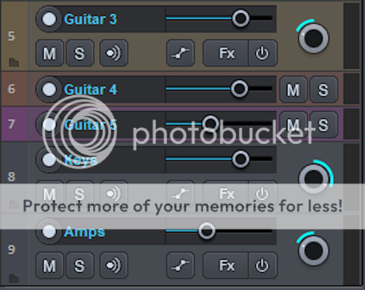
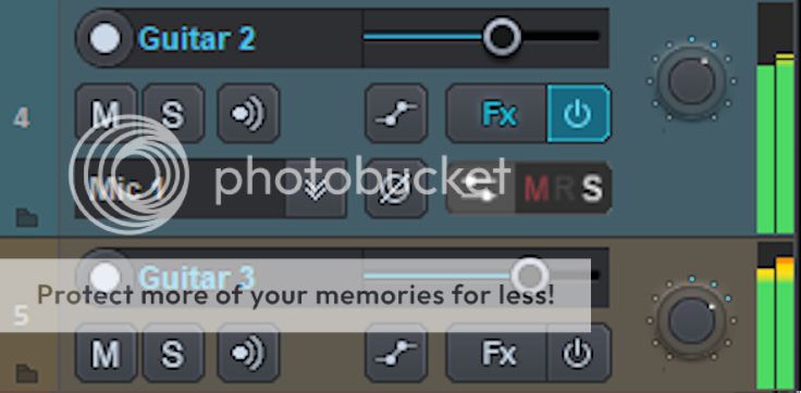
small update Bus and vca track 

|
|
|
|
|
01-25-2019, 11:55 AM
|
#165
|
|
Human being with feelings
Join Date: Feb 2008
Location: So Florida
Posts: 1,395
|
Very Nice.....
|
|
|
|
|
01-25-2019, 12:00 PM
|
#166
|
|
Human being with feelings
Join Date: Oct 2017
Location: Black Forest
Posts: 5,067
|
Amazing, just as it should be!
|
|
|
|
|
01-25-2019, 12:13 PM
|
#167
|
|
Human being with feelings
Join Date: Nov 2015
Location: Switzerland
Posts: 1,966
|
Take...
My...
Fucking...
Money
|
|
|
|
|
01-25-2019, 12:18 PM
|
#168
|
|
Human being with feelings
Join Date: Oct 2017
Location: Larisa, Greece
Posts: 3,827
|
Nice even though i 'd prefer some horizontal lines in the mixer where the insert fx are to see better the difference when adding multiple fx but that's just me,great work.
|

|
|
|
01-25-2019, 12:25 PM
|
#169
|
|
Human being with feelings
Join Date: Nov 2015
Location: Switzerland
Posts: 1,966
|
There are a few things that have too much stroke in my opinion:
- the send icon
- the Fx word
- the bus icon
|
|
|
|
|
01-27-2019, 05:27 AM
|
#170
|
|
Human being with feelings
Join Date: Sep 2013
Posts: 715
|
Modern Pan:
Classic Pan:
And here's a very fast mockup replacing the Blue base color with Yellow or Green..
Yellow - http://imgbox.com/DAsMhWLP
Green - http://imgbox.com/8nErMqyr
It's a bit excessive/basic; different Shades of color could be used,
but I think the tracks and Toolbar buttons feel right.
I also tried with Red and Purple, but it didn't work as well for some reason..
PS: Forgot the dots!
Last edited by ernzo; 01-30-2019 at 06:56 AM.
|
|
|
|
|
01-27-2019, 08:05 AM
|
#171
|
|
Human being with feelings
Join Date: Oct 2007
Posts: 784
|
I'd love for the TCP pan to be the same as in the latest MCP showing, except with coloured fill like the volume control (in the TCP)
|
|
|
|
|
01-27-2019, 11:49 AM
|
#172
|
|
Human being with feelings
Join Date: Jun 2009
Location: Croatia
Posts: 24,798
|
@Blankfiles - good point by rothchild. Can you make the volume and pan faders in MCP have the blue fill just like the vol slider in TCP? That could be great, actually.
|
|
|
|
|
01-29-2019, 01:11 AM
|
#173
|
|
Human being with feelings
Join Date: Nov 2007
Location: Omicron Persei 8
Posts: 3,245
|
+1
Or +2 I guess
|
|
|
|
|
01-29-2019, 07:57 AM
|
#174
|
|
Human being with feelings
Join Date: Jan 2015
Location: Canada
Posts: 1,474
|
Good point ! no problem for the pan but for the volume i will see what its possible to do ,once again its a problem whit transparency
|
|
|
|
|
01-29-2019, 11:44 AM
|
#175
|
|
Human being with feelings
Join Date: Jan 2019
Location: UK
Posts: 938
|

Hi there,
I love the look of this theme, great work. A slight mod/request for the MCP tracks...
Current:
Mod:
The very subtle mod just adds a highlight line on the left hand side, with a *very* subtle light gradient. We read from left to right, so seeing the highlight on that side gives us a 'root' to base our vision from, marking the start and end of each vertical track. This is especially useful in our peripheral vision (big part of DAW UI/UX).
Stare at the center slider on each version. In the mod your eye/mind will find it easier to identify where each track starts and ends.
Rather than being: fader-meter-fader-meter-fader-meter-fader-meter
It's: fader-meter : fader-meter : fader-meter : fader-meter
P.S. The subtle gradient highlight is only on the track panel 'body' (ends at horizontal sliders), while the single line highlight continues up to the top of the track FX. Just a quick edit so the highlight doesn't follow the curve at the top.
Thin outlines—for the track names—aren't very well suited for peripheral vision. Solid/thick lines root the eye at the base, are easily seen peripherally, and act as a mirror to the top of the FX window (top and bottom 'book ends' around the track). Easier to group tracks visually with solid blocks/lines too. They match the dividers between FX and sends also; consistency = sexy :¬)
Two small changes that make each track 'feel' well defined and contained (from left-right and top-bottom).
FWIW, I used to be a pro UI/UX consultant for global bank/mobile brands. These are great (simple) tricks that keep the user knowing where they are within a UI, making it more usable/enjoyable in the long term. Free to completely ignore all this of course, just my 2c that may or may not be useful.
Last edited by b0se; 01-29-2019 at 12:16 PM.
|
|
|
|
|
01-29-2019, 10:50 PM
|
#176
|
|
Human being with feelings
Join Date: Jun 2014
Location: Sweden
Posts: 329
|
Fantastic theme -- can't wait to try it out!
|
|
|
|
|
01-30-2019, 04:07 AM
|
#177
|
|
Human being with feelings
Join Date: Feb 2008
Location: 6950 DK
Posts: 661
|
This is such a great looking theme. I think this will elevate my Reaper experience. I just hope that it does see the light of day and not be abandoned like so many other nice looking potentials. If this needs to be a paid theme, then I'm in. Just finish it and lets have it. PLEASE!!
__________________
REAPING HAVOC SINCE 2008
|
|
|
|
|
01-31-2019, 01:03 PM
|
#178
|
|
Human being with feelings
Join Date: Jan 2019
Location: UK
Posts: 938
|
Happy to pay also.
|
|
|
|
|
02-01-2019, 03:49 AM
|
#179
|
|
Human being with feelings
Join Date: Sep 2009
Location: Northern Lights
Posts: 749
|
Perfect 👌👌👌👌👌
Rock On!
__________________
OS: Manjaro KDE Plasma, Reaper For Linux (64Bit) native linux-vst plugins, LSP-Plugins, TpL-Plugins, Harrison's AVA & VST Plugins. Behringer U-PHORIA UMC22.
|
|
|
|
|
02-16-2019, 08:24 AM
|
#180
|
|
Human being with feelings
Join Date: Nov 2007
Location: Omicron Persei 8
Posts: 3,245
|
B-B-B-B-Bump because I STILL want this so badly
|
|
|
|
|
02-18-2019, 11:26 AM
|
#181
|
|
Human being with feelings
Join Date: Jan 2019
Location: I live everywhere, or I'd be dead!
Posts: 71
|
Wow, I've been searching for a theme to make Reaper look plainer and more enticing. I've tried a few that are really nice, even looked at editing themes to include aspects I liked, though found this too much for me. This theme is the best I've seen yet, and there are some stunners out there!
Will it be free? Is there an estimated release date for it at all?
|
|
|
|
|
02-19-2019, 12:01 AM
|
#182
|
|
Human being with feelings
Join Date: Jul 2016
Location: Ohio, USA
Posts: 633
|
Quote:
Originally Posted by sl23
Will it be free? Is there an estimated release date for it at all?
|
Quote:
Originally Posted by Blankfiles
Evildragon this the will be free ..if you want to give some beer ........ !!
|
Blankfiles says this theme will be free!!!! An awesome thing since there have been problems with people posting his full themes on the stash and circumventing his donation method. A forgiving guy, and with the look of his newest ILogic 3 screencaps.....truly a REAPER theme God...or at least demigod.
|
|
|
|
|
02-19-2019, 03:09 AM
|
#183
|
|
Human being with feelings
Join Date: Jan 2019
Location: I live everywhere, or I'd be dead!
Posts: 71
|
Excellent! Thank you blankfiles
It's wrong people ripping off your idea but it seems you have some loyal followers! Hopefully you haven't given up on this theme as it looks astounding 
__________________
Know that by knowing which everything be known.
|
|
|
|
|
02-20-2019, 02:45 PM
|
#184
|
|
Human being with feelings
Join Date: Aug 2009
Posts: 174
|
Wow....looks fantastic.
I dont even own SD3 but I want this!
|
|
|
|
|
02-21-2019, 04:45 PM
|
#185
|
|
Human being with feelings
Join Date: Jan 2015
Location: Canada
Posts: 1,474
|
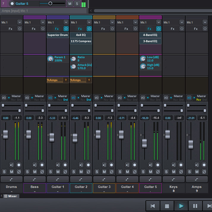
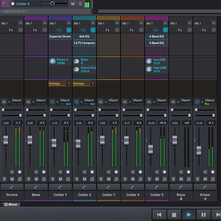
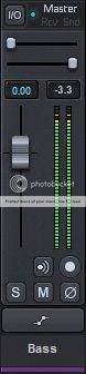
Small Update (request ) Here is what looks like blue in the volume! a lot of headaches to succeed not to pass it in front of the name label but here it works and I like it!, I also add a pan label but I'm not on it seems to overload!
and yellow line for the buses,So what that you think ! any suggestion ? thanks

|
|
|
|
|
02-21-2019, 05:06 PM
|
#186
|
|
Human being with feelings
Join Date: Nov 2015
Location: Switzerland
Posts: 1,966
|
I love it! Im dying to try it out...
What about auxes and premaster channels?
|
|
|
|
|
02-21-2019, 05:10 PM
|
#187
|
|
Human being with feelings
Join Date: Jan 2015
Location: Canada
Posts: 1,474
|
For sure aux and pre master i always work whit that :P
|
|
|
|
|
02-21-2019, 05:55 PM
|
#188
|
|
Human being with feelings
Join Date: Feb 2015
Posts: 93
|
I think it looks great, I wouldn't change anything.
|
|
|
|
|
02-21-2019, 07:26 PM
|
#189
|
|
Human being with feelings
Join Date: Nov 2007
Location: Omicron Persei 8
Posts: 3,245
|
Sweeeeeeeeet
|
|
|
|
|
02-22-2019, 12:48 AM
|
#190
|
|
Human being with feelings
Join Date: May 2011
Posts: 36
|
Just a cosmetic change :
The '0' label on the volume slider should be located on the right instead of the left. Now, it seems to close to the leftedge, and there is an empty gap between the volume slider and the metering.
|
|
|
|
|
02-22-2019, 03:08 AM
|
#191
|
|
Human being with feelings
Join Date: May 2017
Posts: 21
|
Quote:
Originally Posted by Blankfiles
Small Update (request ) Here is what looks like blue in the volume! a lot of headaches to succeed not to pass it in front of the name label but here it works and I like it!, I also add a pan label but I'm not on it seems to overload!
and yellow line for the buses,So what that you think ! any suggestion ? thanks
|
Blue looks great
|
|
|
|
|
02-22-2019, 07:03 AM
|
#192
|
|
Human being with feelings
Join Date: Jan 2015
Posts: 135
|
Looks great so far. But I would make no labels for pan or smaller. And the colour for the sends is to light.
|
|
|
|
|
02-22-2019, 07:15 AM
|
#193
|
|
Human being with feelings
Join Date: Oct 2017
Location: Black Forest
Posts: 5,067
|
I actually wouldn't change anything, now. The problem I see is: this theme will never be finished if everybody is nitpicking like crazy. It's clear that people want different things and apparently it's not possible to please everyone.
My advice would be: if people want changes after the theme has been released, make a donation.
Plus, we have to use a theme, to judge if it is working the way it looks like.
Of course Blankfiles has to agree about this.
But maybe this way everybody will be happy.
|
|
|
|
|
02-22-2019, 08:31 AM
|
#194
|
|
Human being with feelings
Join Date: Feb 2008
Location: Eesti
Posts: 2,721
|
I like it!
|
|
|
|
|
02-22-2019, 08:32 AM
|
#195
|
|
Human being with feelings
Join Date: Jan 2019
Location: I live everywhere, or I'd be dead!
Posts: 71
|
I agree, but mainly cos I so wanna try it out!
It is most definitely one of the best themes I've seen for any app, along with Reaprise. I'll struggle to know which to use! Lol
Both are amazing efforts and can't wait to try them out
__________________
Know that by knowing which everything be known.
|
|
|
|
|
02-22-2019, 02:50 PM
|
#196
|
|
Human being with feelings
Join Date: Mar 2012
Posts: 61
|
This is really great, it will probably replace my current Janne2016 theme.
My suggestions- (maybe its been talked about already)
in mcp maybe it would be visually good to have some separation of the effect and send slots with some lines (a bit darker hue or smth) ?
Also still not a huge fan of the big separated pan knob in tcp, since the parameter isn't SO much more important than the rest are.
Do you have some plans for having a light version of the arrange backround and items aswell? The neon-style edges and color seem kind of confusing. If you dont plan to do that, I guess it wouldnt be hard to customize it later..
But anyway, as I said at the beginning- fantastic work
|
|
|
|
|
02-22-2019, 04:02 PM
|
#197
|
|
Human being with feelings
Join Date: Jan 2019
Location: I live everywhere, or I'd be dead!
Posts: 71
|
Quote:
Originally Posted by b0se
Hi there,
I love the look of this theme, great work. A slight mod/request for the MCP tracks...
Mod...
The very subtle mod just adds a highlight line on the left hand side, with a *very* subtle light gradient. We read from left to right, so seeing the highlight on that side gives us a 'root' to base our vision from, marking the start and end of each vertical track. This is especially useful in our peripheral vision (big part of DAW UI/UX).
Stare at the center slider on each version. In the mod your eye/mind will find it easier to identify where each track starts and ends.
Rather than being: fader-meter-fader-meter-fader-meter-fader-meter
It's: fader-meter : fader-meter : fader-meter : fader-meter
P.S. The subtle gradient highlight is only on the track panel 'body' (ends at horizontal sliders), while the single line highlight continues up to the top of the track FX. Just a quick edit so the highlight doesn't follow the curve at the top.
Thin outlinesfor the track namesaren't very well suited for peripheral vision. Solid/thick lines root the eye at the base, are easily seen peripherally, and act as a mirror to the top of the FX window (top and bottom 'book ends' around the track). Easier to group tracks visually with solid blocks/lines too. They match the dividers between FX and sends also; consistency = sexy :¬)
Two small changes that make each track 'feel' well defined and contained (from left-right and top-bottom).
FWIW, I used to be a pro UI/UX consultant for global bank/mobile brands. These are great (simple) tricks that keep the user knowing where they are within a UI, making it more usable/enjoyable in the long term. Free to completely ignore all this of course, just my 2c that may or may not be useful. |
I have to agree this little mod makes a difference and would like to see it added to the final version.
__________________
Know that by knowing which everything be known.
|
|
|
|
|
02-24-2019, 03:51 AM
|
#198
|
|
Human being with feelings
Join Date: Jan 2019
Location: I live everywhere, or I'd be dead!
Posts: 71
|
Quote:
Originally Posted by chrisdodge
Just a cosmetic change :
The '0' label on the volume slider should be located on the right instead of the left. Now, it seems to close to the leftedge, and there is an empty gap between the volume slider and the metering.
|
Could the Volume Slider be moved to the right slighty?
__________________
Know that by knowing which everything be known.
|
|
|
|
|
02-24-2019, 05:25 AM
|
#199
|
|
Human being with feelings
Join Date: Sep 2013
Posts: 715
|
Or just take it out alltogheter..
|
|
|
|
|
02-24-2019, 10:23 AM
|
#200
|
|
Human being with feelings
Join Date: Jul 2018
Location: Canada
Posts: 172
|
Quote:
Originally Posted by chrisdodge
Just a cosmetic change :
The '0' label on the volume slider should be located on the right instead of the left. Now, it seems to close to the leftedge, and there is an empty gap between the volume slider and the metering.
|
The idea is to be coherent with Superior Drummer, which has the 0 located at this exact spot. There's nothing wrong with improving an already existing GUI, but when the premise is to make REAPER look like Superior Drummer, at some point there are things that one must let go of. The theme looks final to me, when it comes to looking like SD.
|
|
|
|
| Thread Tools |
|
|
| Display Modes |
 Linear Mode Linear Mode
|
 Posting Rules
|
You may not post new threads
You may not post replies
You may not post attachments
You may not edit your posts
HTML code is Off
|
|
|
All times are GMT -7. The time now is 05:27 AM.
|


