 |
|

|
 04-28-2022, 06:36 AM
|
#81
|
|
Human being with feelings
Join Date: May 2006
Location: NA - North Augusta South Carolina
Posts: 4,294
|
I like the neumorphic bright meters and indicators, and skeumorphic buttons/moveable elements. I also like dark themes; although I'd like the "raised" surfaces to have more contrast relative to the "flat" surfaces, as well as delineation between tracks on the TCP panel.
Nice looking theme. Slava Ukraine.
|

|

|
|
04-28-2022, 06:59 AM
|
#82
|
|
Human being with feelings
Join Date: Oct 2017
Location: U.K
Posts: 542
|
Quote:
Originally Posted by AndreiT

Really cool theme!
My issues are :
1.I can't see the "Width" knob in the TCP.
2. In MIDI editor, the "color notes by pitch" doesn't work.
3. TCP tinted track panel background is not enabled. Can we get that feature?
Thanks!
Greetings from Romania!
|
Good points and would love to try TCP tinted track panel background if possible somehow.
|
|
|
|
|
04-28-2022, 08:49 AM
|
#83
|
|
Human being with feelings
Join Date: Jan 2019
Location: Toronto Canada
Posts: 81
|
I really don't want to weigh in on the discussion of what constitutes a new versus a modified theme. I respect White Tie's contributions to completely reimagined ideas.
This Neptune theme, derivative as it may be is actually pretty visually clear and functional and I like it a lot. I did modify the "peaks" in the theme tweaker to be more gray (190, 190, 190) to stand out against some of my lighter track colours.
There's room for both approaches in this forum.
|
|
|
|
|
04-29-2022, 06:21 AM
|
#84
|
|
Human being with feelings
Join Date: Dec 2018
Location: Ukraine
Posts: 41
|
Quote:
Originally Posted by chip mcdonald
I like the neumorphic bright meters and indicators, and skeumorphic buttons/moveable elements. I also like dark themes; although I'd like the "raised" surfaces to have more contrast relative to the "flat" surfaces, as well as delineation between tracks on the TCP panel.
Nice looking theme. Slava Ukraine.
|
Thank you!<3
Quote:
Originally Posted by Ideosound
Good points and would love to try TCP tinted track panel background if possible somehow.
|
It is possible! I will add tinted TCP option with next update. 
|
|
|
|
|
04-29-2022, 07:38 AM
|
#85
|
|
Human being with feelings
Join Date: Jan 2019
Location: Toronto Canada
Posts: 81
|
One of the things I do is separate orchestral ensembles in to separate instrument tracks. I select notes and assign them to "Voice" high default and low. Usually I can quickly see the different voices when the item is colored by voice. In this theme all the voices are the same purple... and I can't figure out where to tweak it.
Any help for me??
|
|
|
|
|
04-29-2022, 01:28 PM
|
#86
|
|
Human being with feelings
Join Date: Dec 2018
Location: Ukraine
Posts: 41
|
First post updated!
♆ Neptune VI 1.0.1
Changelog:
Tinted TCP option added in Layout C. (Can be set as default in Screensets/Layouts window)
Slightly changed Track Panel text color for better readability when tinted TCP is enabled.
Color note by voice issue fixed.
|
|
|
|
|
04-29-2022, 02:49 PM
|
#87
|
|
Human being with feelings
Join Date: Jan 2019
Location: Toronto Canada
Posts: 81
|
 1.01 update
Well done!!
|
|
|
|
|
04-30-2022, 05:12 AM
|
#88
|
|
Human being with feelings
Join Date: Oct 2017
Location: U.K
Posts: 542
|
I think the tinted colour TCP makes it much easier and nicer to use great job, I really like it. I wondered about the media explorer, I tried changing the bottom audio preview section so it doesn't stand out as much, could be good default behaviour?
When you click on files in the side tab and main media explorer, the text is white against a grey rectangle, maybe this text could stand out more, a colour similar to the blue/purple on the media explorer icons?

|
|
|
|
|
05-02-2022, 09:04 AM
|
#89
|
|
Human being with feelings
Join Date: Oct 2017
Location: Larisa, Greece
Posts: 3,827
|
Hi, would it be possible to change the color to items and notes when they are muted? It's a bit confusing to see what's being muted or not, thanks
|
|
|
|
|
05-03-2022, 11:24 AM
|
#90
|
|
Human being with feelings
Join Date: Mar 2020
Posts: 66
|
Nice & clean, I really like it!
|
|
|
|
|
05-03-2022, 02:28 PM
|
#91
|
|
Human being with feelings
Join Date: Dec 2018
Location: Ukraine
Posts: 41
|
Quote:
Originally Posted by DocBob
Well done!!
|
Quote:
Originally Posted by Sarasota_FOH
Nice & clean, I really like it!
|
Thank you!
Quote:
Originally Posted by Ideosound
I think the tinted colour TCP makes it much easier and nicer to use great job, I really like it. I wondered about the media explorer, I tried changing the bottom audio preview section so it doesn't stand out as much, could be good default behaviour?
When you click on files in the side tab and main media explorer, the text is white against a grey rectangle, maybe this text could stand out more, a colour similar to the blue/purple on the media explorer icons?
|
Quote:
Originally Posted by Vagelis
Hi, would it be possible to change the color to items and notes when they are muted? It's a bit confusing to see what's being muted or not, thanks |
Will look into both of these issues in the next update along with some other small tweaks.
Here's a quick sneak peek of what i'm currently busy with: 

After i am done with "♆ Neptune VI 200%(4K)" i want to run a virtual machine with macOS installed to hopefully iron out some specific mac related issues that i don't encounter on windows.
I also want to thank everyone who donated! I really appreciate that!
|
|
|
|
|
05-04-2022, 01:36 PM
|
#92
|
|
Human being with feelings
Join Date: Dec 2017
Posts: 6
|
Looking really nice. Thank you for working on 4k version! WEll done!
|
|
|
|
|
05-06-2022, 11:46 AM
|
#93
|
|
Human being with feelings
Join Date: Apr 2016
Location: Ukraine
Posts: 49
|
Great theme! Look very nice.
Where were you eight years ago?
When I had to draw my own theme myself
|
|
|
|
|
05-07-2022, 05:22 PM
|
#94
|
|
Human being with feelings
Join Date: Dec 2011
Posts: 171
|
Just reporting that the record arm light seems to move vertically on the MCP. Really like the aesthetics of this so far!
|
|
|
|
|
05-08-2022, 02:59 PM
|
#95
|
|
Human being with feelings
Join Date: Dec 2018
Location: Ukraine
Posts: 41
|
Quote:
Originally Posted by mks
Just reporting that the record arm light seems to move vertically on the MCP. Really like the aesthetics of this so far!
|
Ah yes, thanks! It was fixed a while ago but looks like i forgot to actually put fixed one inside theme
Quote:
Originally Posted by Broojacker
Great theme! Look very nice.
|
Thank You!
Quote:
Originally Posted by Broojacker
Where were you eight years ago?
When I had to draw my own theme myself |
I brought maps!!

|
|
|
|
|
05-08-2022, 03:54 PM
|
#96
|
|
Human being with feelings
Join Date: Dec 2018
Location: Ukraine
Posts: 41
|
First post updated!
♆ Neptune VI 1.1

Changelog:
Neptune VI 200%(4K) Release.
Track id numbers in folders are now correctly displayed.
Muted items overlay color fixed.
Media Explorer waveform background color changed.
Media Explorer "Selected Text/Row" colors adjusted to correctly display on both macOS and Windows.
Media Explorer transport buttons minor redesign for consistent look on both macOS and Windows.
TCP "Record Monitoring" button color adjusted for Tinted TCP Layout.
MCP folder background color under tracks fixed.
New REAPER 6.57 gen_panbg_horz_dark, gen_vol_dark, gen_pan_dark images are added for macOS dark mode.
Layout A and B are now tinted instead of Layout C!
|
|
|
|
|
05-08-2022, 07:26 PM
|
#97
|
|
Human being with feelings
Join Date: Feb 2014
Posts: 312
|
Really liking this!
It would be great to have just a tiny bit more contrast in the tcp and mcp [like making the grey text/symbols on the buttons a bit brighter and/or the background slightly darker].
[Also, with how I have my project template set up, the dark blue I use for quite a few tracks makes the track names difficult to see]
|
|
|
|
|
05-09-2022, 02:27 AM
|
#98
|
|
Human being with feelings
Join Date: Mar 2007
Location: London UK
Posts: 3,379
|
Quote:
Originally Posted by JayJSE2
Really liking this!
It would be great to have just a tiny bit more contrast in the tcp and mcp [like making the grey text/symbols on the buttons a bit brighter and/or the background slightly darker].
[Also, with how I have my project template set up, the dark blue I use for quite a few tracks makes the track names difficult to see]
|
yep, I always like to have track names(text) NOT coloured like the tracks for this reasons.
is there anyway to do this in the tweaks or does it need to be done at a deeper level?
M
|
|
|
|
|
05-09-2022, 02:40 AM
|
#99
|
|
Human being with feelings
Join Date: Oct 2017
Location: Larisa, Greece
Posts: 3,827
|
Quote:
Originally Posted by Sol
First post updated!
Changelog:
• Neptune VI 200%(4K) Release.
• Track id numbers in folders are now correctly displayed.
• Muted items overlay color fixed.
• Media Explorer waveform background color changed.
• Media Explorer "Selected Text/Row" colors adjusted to correctly display on both macOS and Windows.
• Media Explorer transport buttons minor redesign for consistent look on both macOS and Windows.
• TCP "Record Monitoring" button color adjusted for Tinted TCP Layout.
• MCP folder background color under tracks fixed.
• New REAPER 6.57 gen_panbg_horz_dark, gen_vol_dark, gen_pan_dark images are added for macOS dark mode.
• Layout A and B are now tinted instead of Layout C!
|
Amazing thanks a lot!
Edit: I was using the version with the fx slots to the side of TCP, is it possible to add this version too? I deleted the previous one :P
Last edited by Vagelis; 05-09-2022 at 02:53 AM.
|
|
|
|
|
05-09-2022, 03:49 AM
|
#100
|
|
Human being with feelings
Join Date: Apr 2016
Posts: 27
|
Quote:
Originally Posted by norbury brook
yep, I always like to have track names(text) NOT coloured like the tracks for this reasons.
is there anyway to do this in the tweaks or does it need to be done at a deeper level?
M
|
+2 on this one
it's not a huge issue, but as the track color gets darker it is indeed hard to see
if that saturation could be brought all the way down somehow, that would be cool : )
|
|
|
|
|
05-09-2022, 10:11 AM
|
#101
|
|
Human being with feelings
Join Date: Mar 2007
Location: London UK
Posts: 3,379
|
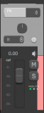
also, as I like the general theme vibe, is it just me, or does any one else find it hard to see the fader caps?
m
|
|
|
|
|
05-09-2022, 12:03 PM
|
#102
|
|
Human being with feelings
Join Date: Oct 2017
Location: U.K
Posts: 542
|
Quote:
Originally Posted by norbury brook
also, as I like the general theme vibe, is it just me, or does any one else find it hard to see the fader caps?
m
|
I had mentioned this also but I think it was missed. The theme is improving greatly with more user feedback, great job.
|
|
|
|
|
05-09-2022, 01:07 PM
|
#103
|
|
Human being with feelings
Join Date: Jul 2007
Location: New Joisey
Posts: 6,027
|
Quote:
Originally Posted by norbury brook
also, as I like the general theme vibe, is it just me, or does any one else find it hard to see the fader caps?
m
|
I have the same feedback. I think some gray (lighter) fader caps would be a nice option. Very, very nice looking theme.
|
|
|
|
|
05-09-2022, 01:16 PM
|
#104
|
|
Human being with feelings
Join Date: Jul 2009
Posts: 7,598
|
Quote:
Originally Posted by pekki
+2 on this one
it's not a huge issue, but as the track color gets darker it is indeed hard to see
if that saturation could be brought all the way down somehow, that would be cool : )
|
don't forget the theme adjuster script has saturation, contrast, gamma etc controls.
|
|
|
|
|
05-09-2022, 01:22 PM
|
#105
|
|
Human being with feelings
Join Date: Dec 2018
Location: Ukraine
Posts: 41
|
Quote:
Originally Posted by Vagelis
Amazing thanks a lot!
Edit: I was using the version with the fx slots to the side of TCP, is it possible to add this version too? I deleted the previous one :P
|
First post updated.
I provided additional link at the bottom.
|
|
|
|
|
05-09-2022, 06:55 PM
|
#106
|
|
Human being with feelings
Join Date: Dec 2018
Location: Ukraine
Posts: 41
|
First post updated!
♆ Neptune VI 1.1.1

Changelog:
Track label color logic tweaked for better readability.
TCP volume/pan/width text color tweaked for better readability
MCP fader thumb color tweaked for better visual distinction.
|
|
|
|
|
05-10-2022, 03:19 AM
|
#107
|
|
Human being with feelings
Join Date: Aug 2011
Location: Germany
Posts: 241
|
Quote:
Originally Posted by Sol
First post updated!
♆ Neptune VI 1.1.1 |
I really appreciate your work!
May I ask for a bit more love for the 150% variant, especially the mixer layout?
It doesn't look correct at all, icons are a bit off,.. you see what I mean:
Would you consider to look at it?
|
|
|
|
|
05-10-2022, 06:39 AM
|
#108
|
|
Human being with feelings
Join Date: Mar 2007
Location: London UK
Posts: 3,379
|
Quote:
Originally Posted by Lopez
I really appreciate your work!
May I ask for a bit more love for the 150% variant, especially the mixer layout?
It doesn't look correct at all, icons are a bit off,.. you see what I mean:
Would you consider to look at it? |
yes on my 4k laptop the 150% are all very funky... the narrow view loses he volume knob all together
great theme though, keep going.
I'd still like to see more contrast on the text on a lot of places. I have a side docker with tabs and I can't read the tabs as the text is dark gray.
M
|
|
|
|
|
05-10-2022, 07:49 AM
|
#109
|
|
Human being with feelings
Join Date: May 2022
Posts: 9
|
Quote:
Originally Posted by Sol
First post updated!
[CENTER]♆ Neptune VI 1.1.1
|
Thank you so much for your theme, incredible work!
But I have question.
How can I delete or change the color of the purple line when I selected tracks?
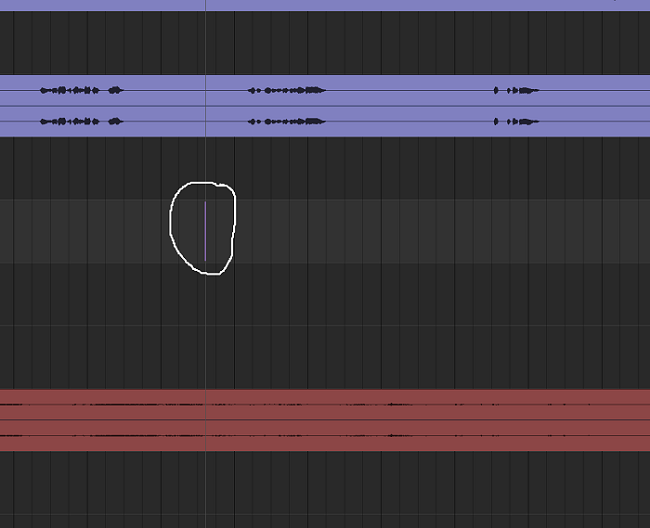
Thanks!
|
|
|
|
|
05-10-2022, 04:10 PM
|
#110
|
|
Human being with feelings
Join Date: Dec 2018
Location: Ukraine
Posts: 41
|
Quote:
Originally Posted by Lopez
I really appreciate your work!
May I ask for a bit more love for the 150% variant, especially the mixer layout?
It doesn't look correct at all, icons are a bit off,.. you see what I mean:
Would you consider to look at it?
|
Theme is 100%/ 200% as stated in description. You should understand that this is a manual process of resizing and tweaking of more then 300 images that takes considerable amount of time. I can not give any ETA, but i think this is understandable in a current world events.
Quote:
Originally Posted by mikhailrepin
Thank you so much for your theme, incredible work!
But I have question.
How can I delete or change the color of the purple line when I selected tracks?
Thanks!
|
Thank you! You need to uncheck "Highlight edit cursor over last selected track" in REAPER Preferences. (it's in Appearance tab)
|
|
|
|
|
05-10-2022, 05:51 PM
|
#111
|
|
Human being with feelings
Join Date: Jun 2020
Location: Los Angeles, CA
Posts: 106
|
I'm liking this theme! Nice and clean, easy to read
I notice that the "Selection" area of the transport needs a bit more spacing between the values, they are getting clipped when displaying timecode.
www.imgur.com/a/4Tig4tH
__________________
Sound Designer, Audio Lead at Heart Machine
|
|
|
|
|
05-10-2022, 06:50 PM
|
#112
|
|
Human being with feelings
Join Date: Dec 2018
Location: Ukraine
Posts: 41
|
Quote:
Originally Posted by alexgameaudio
I'm liking this theme! Nice and clean, easy to read
I notice that the "Selection" area of the transport needs a bit more spacing between the values, they are getting clipped when displaying timecode.
www.imgur.com/a/4Tig4tH |
Thanks! Will look into it.
|
|
|
|
|
05-10-2022, 11:16 PM
|
#113
|
|
Human being with feelings
Join Date: May 2022
Posts: 9
|
Quote:
|
Thank you! You need to uncheck "Highlight edit cursor over last selected track" in REAPER Preferences. (it's in Appearance tab)
|
Oh thanks!
|
|
|
|
|
05-11-2022, 01:17 AM
|
#114
|
|
Human being with feelings
Join Date: Mar 2007
Location: London UK
Posts: 3,379
|
Quote:
Originally Posted by norbury brook
yep, I always like to have track names(text) NOT coloured like the tracks for this reasons.
is there anyway to do this in the tweaks or does it need to be done at a deeper level?
M
|
i'll answer my own question : yes, it's in the theme editor
M
|
|
|
|
|
05-11-2022, 07:31 AM
|
#115
|
|
Human being with feelings
Join Date: Jul 2020
Posts: 229
|
Great theme! I do have a weird transport UI bug (see attachment).
|
|
|
|
|
05-12-2022, 01:37 AM
|
#116
|
|
Human being with feelings
Join Date: May 2019
Location: Berlin
Posts: 2,205
|
Quote:
Originally Posted by Junolab
Great theme! I do have a weird transport UI bug (see attachment).
|
Probably this hdpi issue.
|
|
|
|
|
05-15-2022, 05:44 AM
|
#117
|
|
Human being with feelings
Join Date: Dec 2018
Location: Ukraine
Posts: 41
|
First post updated!
♆ Neptune VI 1.1.2
Changelog:
Transport text spacing issue fixed.
TCP volume label color fixed.
TCP track label font adjusted for consistency across 100%/ 150%/200%.
|
|
|
|
|
05-16-2022, 06:22 AM
|
#118
|
|
Human being with feelings
Join Date: Aug 2011
Location: Germany
Posts: 241
|
Quote:
Originally Posted by Sol
Theme is 100%/200% as stated in description. You should understand that this is a manual process of resizing and tweaking of more then 300 images that takes considerable amount of time. I can not give any ETA, but i think this is understandable in a current world events.
|
In understand completely! I just kindly ask, if you do consider to fix that - somewhen. You also might answer "No, I don't consider to fix 150% version, just because" ;-)
I really appreciate your work so far! :-*
|
|
|
|
|
05-18-2022, 12:54 PM
|
#119
|
|
Human being with feelings
Join Date: Mar 2011
Location: USA
Posts: 462
|
Quote:
Originally Posted by Sol
Theme is 100%/200% as stated in description. You should understand that this is a manual process of resizing and tweaking of more then 300 images that takes considerable amount of time. I can not give any ETA, but i think this is understandable in a current world events.
Thank you! You need to uncheck "Highlight edit cursor over last selected track" in REAPER Preferences. (it's in Appearance tab)
|
Awesome theme!!
BTW the Creative Cloud Marketplace has extensions for automating this sort of scaling stuff in PS.
|
|
|
|
|
05-18-2022, 09:45 PM
|
#120
|
|
Human being with feelings
Join Date: Dec 2018
Location: Ukraine
Posts: 41
|
Quote:
Originally Posted by Lopez
In understand completely! I just kindly ask, if you do consider to fix that - somewhen. You also might answer "No, I don't consider to fix 150% version, just because" ;-)
I really appreciate your work so far! :-*
|
Thanks! 150% will happen eventually.🙂
Quote:
Originally Posted by nepenthe
Awesome theme!!
BTW the Creative Cloud Marketplace has extensions for automating this sort of scaling stuff in PS.
|
Thank you!! I use Affinity Designer and it has built in tools, the things is that only part of images can be automatically rescaled, others require manual treatment and tweaking to correctly display.
|
|
|
|
| Thread Tools |
|
|
| Display Modes |
 Linear Mode Linear Mode
|
 Posting Rules
|
You may not post new threads
You may not post replies
You may not post attachments
You may not edit your posts
HTML code is Off
|
|
|
All times are GMT -7. The time now is 05:38 PM.
|


