 |
|

|
 05-05-2019, 06:26 AM
|
#481
|
|
Pixel Pusher
Join Date: Mar 2007
Location: Blighty
Posts: 4,982
|
I understand that some of you want to talk about the design. Some of you don't like the theme, are not convinced by what I've done and/or why I have done it. You wish to voice your opinion on the matter.
Fair enough.
We then come to the question of why you are doing it in this testing thread, rather than anywhere else on the forum, when I have explained that it will have no effect other than to interfere with the important work that needs to be done. If you really do believe your opinion is valuable and reasoned, you do nothing to demonstrate that by posting it in a place where it is disruptive and without purpose. It is without purpose because, as I have said before:
I'm not going to do design by committee on the forum.
|

|
|
|
05-05-2019, 07:28 AM
|
#482
|
|
Human being with feelings
Join Date: May 2006
Location: NA - North Augusta South Carolina
Posts: 4,294
|
Quote:
Originally Posted by Coachz

Regarding the Custom Colors. I think it would be more user friendly if the user could make their own palettes simply by pasting in some hex like:
#0468BF #22A2F2 #52B5F2 #5BC6F5 #91E0F2
Adobe color picker makes is so easy to find palettes and then we could use them instead of only have the choices of the author.
https://color.adobe.com/search?q=ocean%20blue
 |
Seconded.
|
|
|
|
|
05-05-2019, 07:36 AM
|
#483
|
|
Human being with feelings
Join Date: Aug 2007
Location: Luxembourg/Spain
Posts: 1,922
|
Quote:
Originally Posted by White Tie
We then come to the question of why you are doing it in this testing thread, rather than anywhere else on the forum, when I have explained that it will have no effect other than to interfere with the important work that needs to be done.
|
I've created https://forum.cockos.com/showthread....24#post2130224 for people to vent it. Hopefully that will help preventing this thread from being derailed the whole time.
__________________
Reaper for Linux Documentation (WIP). Software: Archlinux/KDE, Fabfilter FX, Komplete 8, Nebula, Schwa/Stillwell, T-racks Max/Amplitube/SVX, etc. Gear: i7-2600k/4700HQ/16GB, RME Multiface/Babyface, Behringer X32, Genelec 8040, etc. :)
|
|
|
|
|
05-05-2019, 12:52 PM
|
#484
|
|
Human being with feelings
Join Date: Jul 2015
Location: Stockholm, Sweden
Posts: 1,343
|
WT, overall its looking quite nice and slick, a couple of things:
- Please can you make us an option to tint the mcp ch. strips in the script? So we who like this doesnt have to make some half shitty tweak.
- I do think the timesel/tempo/signature text in the transport is too small by default, and more importantly it does not scale up with the rest.
- The region color is too unsaturated compared to the markers.
- As someone else said the blue line when dragging tracks into folders does not indent.
- The record input text is almost not readable, way too little contrast. Overall the readability should get an overhaul here and there...and this is not a design comment=)
Btw, I have very good eye sight.
__________________
Magnus Lindberg Productions - VRTKL Audio - Redmount Studios
magnuslindberg.com
|
|
|
|
|
05-05-2019, 01:29 PM
|
#485
|
|
Human being with feelings
Join Date: Aug 2010
Location: They put me in a home.
Posts: 3,432
|

Quote:
Originally Posted by cool
Right. Reaper remains my favorite DAW and the only one working tool, but I will recommend another program to any new user. Paradox.
The interface is the face of the program and least of all I would like to miss in this part. Here everything must be perfect and in step with the times.
|
Bingo. Nothing will change until the wrong people are gone and the right people "care" about things like progress, relevancy, user base, business, and basic stuff. Housekeeping. Is Reaper really just a pet project from a cool dude who has some money and not a care? 
Quote:
Originally Posted by jinotsuh
hmmmm, just when you thought REAPER couldn't get any uglier.
No offence, I couldn't do any better, or even a thousandth of what this is, but it's still damn ugly, and nothing that inspires me to spend any amount of time in it's environment. Over the years I've tried many custom themes, and as ugly as the default is/was, for whatever reason it's always where I ended up.
|
It's pretty bad. Hopefully by 6 launch it'll be at the very least usable. It's a giant step backwards.
__________________
47.8% of statistics are made up.
|
|
|
|
|
05-05-2019, 01:45 PM
|
#486
|
|
Human being with feelings
Join Date: Aug 2018
Posts: 116
|
Quote:
Originally Posted by White Tie
Expectation is that mixer strip layouts will NOT be included, my impression is that few users use them, and they would come at the cost of much greater complexity for new users. I encourage feedback on this decision, and I will make it as easy as possible for modders to add them in.[/list]
|
What??
No custom channelstrip for us? SHAME SHAME
Seriously, dudes, we have been waiting for this for ages!
|
|
|
|
|
05-05-2019, 03:55 PM
|
#487
|
|
Mortal
Join Date: Jan 2006
Location: Wickenburg, Arizona
Posts: 14,051
|
Quote:
Originally Posted by White Tie
I understand that some of you want to talk about the design. Some of you don't like the theme, are not convinced by what I've done and/or why I have done it. You wish to voice your opinion on the matter.
Fair enough.
We then come to the question of why you are doing it in this testing thread, rather than anywhere else on the forum, when I have explained that it will have no effect other than to interfere with the important work that needs to be done.
|
There's probably some gray area in what is design and what is a bug
For instance, if in testing we find that common elements cannot be seen due to the design, isn't that a bug we're supposed to be testing for?
|
|
|
|
|
05-05-2019, 04:29 PM
|
#488
|
|
Pixel Pusher
Join Date: Mar 2007
Location: Blighty
Posts: 4,982
|
Quote:
Originally Posted by pipelineaudio
There's probably some gray area in what is design and what is a bug
|
Certainly, it is in the nature of design that much is compromise, and without common sense we're not going to get anywhere. Similarly, if there's something that you think I should look at that other people might disagree with, that ambiguity makes it de-facto not a bug. That doesn't mean I'm not going to look at it again.
There is, as you say, a grey area between a) the design of the theme, which I acknowledge a lot of people take issue with but is not something that can be effectively dealt with on the forum, so we're not doing that, and b) the detail of the theme, for which I am actively seeking feedback.
How to navigate that grey area between design and detail? Dialogue, common sense, compromise and accepting that I need to be constantly making decisions or we're not going to get anywhere, and someone's always going to be absolutely certain I chose the wrong way. That's unavoidable, and I have to accept it. We all have to accept it, or this isn't going to work.
|
|
|
|
|
05-05-2019, 04:38 PM
|
#489
|
|
Mortal
Join Date: Jan 2006
Location: Wickenburg, Arizona
Posts: 14,051
|
I think that makes it clearer then.
Here is a detail which I think needs to be fixed:
Gridlines and Stretch Marker text (among other elements) disappear, or become nearly completely hidden when item is selected

|
|
|
|
|
05-05-2019, 11:13 PM
|
#490
|
|
Human being with feelings
Join Date: Sep 2009
Posts: 863
|
I'm not sure how much work the colours in the midi editor have had yet, but at the moment, unselected note velocity bars are almost invisible.
Selected

Unselected

|
|
|
|
|
05-06-2019, 01:09 AM
|
#491
|
|
Human being with feelings
Join Date: Oct 2013
Posts: 89
|
Sorry if this has been posted already, (13 pages of posts and counting!)
The master track in track panel is stretched and weird. Tested in 2 different machines Win 7 and 10
|
|
|
|
|
05-06-2019, 01:20 AM
|
#492
|
|
Human being with feelings
Join Date: Nov 2015
Posts: 607
|
Quote:
Originally Posted by chuckwood
Sorry if this has been posted already, (13 pages of posts and counting!)
The master track in track panel is stretched and weird. Tested in 2 different machines Win 7 and 10
|
I would say that this is unfinished, seems to be obvious. This is an Alpha ...
|
|
|
|
|
05-06-2019, 01:48 AM
|
#493
|
|
Human being with feelings
Join Date: Dec 2012
Posts: 13,333
|
Quote:
Originally Posted by chuckwood
Sorry if this has been posted already, (13 pages of posts and counting!)
The master track in track panel is stretched and weird. Tested in 2 different machines Win 7 and 10
|
Read the first post.
|
|
|
|
|
05-06-2019, 02:06 AM
|
#494
|
|
Pixel Pusher
Join Date: Mar 2007
Location: Blighty
Posts: 4,982
|
Quote:
Originally Posted by pipelineaudio
Gridlines and Stretch Marker text (among other elements) disappear, or become nearly completely hidden when item is selected
|
This is a good example of how the dialogue gets swamped if there's too much noise; I did actually address this.
I have some ideas to try and some great suggestions to work through, but as it stands its far from clear whether the whole 'full strength color' thing is going to work out.
Quote:
Originally Posted by RobU
I'm not sure how much work the colours in the midi editor have had yet, but at the moment, unselected note velocity bars are almost invisible.
|
ME is difficult at the best of times, but recent changes in the velocity bars have ruled out the whole approach taken by this midi note color map; that of using the borders to do most of the heavy lifting on selected status.
It would be madness this early on to just revert to the old ME and call it done, that seems terribly defeatist, but its very tempting 
|
|
|
|
|
05-06-2019, 02:40 AM
|
#495
|
|
Human being with feelings
Join Date: Dec 2015
Posts: 394
|
I can not see the grid lines at all in this theme.., it is completely unusable for me, i hope this changes.. it is an absolute need to be able to see the grid lines changes we make.., also the 200% does not scale at all on my 5k iMac.
..
.
__________________
16" M1Pro MacBook Pro, 32gig ram, 1TB ssd, macOS 14
|
|
|
|
|
05-06-2019, 03:09 AM
|
#496
|
|
Pixel Pusher
Join Date: Mar 2007
Location: Blighty
Posts: 4,982
|
Quote:
Originally Posted by Futur8me
I can not see the grid lines at all in this theme.., it is completely unusable for me, i hope this changes.. it is an absolute need to be able to see the grid lines changes we make.., also the 200% does not scale at all on my 5k iMac.
..
.
|
I can't tell whether - You have your grid lines switched off.
- You are using hyperbole because you find the grid lines really really dim.
- You are an outlier data point for screen settings / OS color settings
I can't process your feedback if I can't form a clear understanding of where you fit in with all the other feedback. Please, explain.
To give context, here's what's going on with the grid lines : I have a decade of users being dissatisfied with the binary nature of the grid lines, being either off or obtrusive, and being unable to do anything about it because of the way grid lines were themed. We have much more subtle control now, so naturally I'm experimenting with subtlety. This would be the correct time to do that.
The answer lies somewhere between "I only want a slight tickle of grid line, I use the context move line more, and I have my monitor set to the insane brightness it had in the shop" and ReaperBlog's "I want to be smacked in the face by a grid line so strong it could melt diamonds". Its tricky to find the middle ground there, its going to take some experimentation.
I'm not sure what's happening with your HiDPI - is it not working at all? Or is it the layout scaling business that you're having difficulty with?
|
|
|
|
|
05-06-2019, 03:31 AM
|
#497
|
|
Human being with feelings
Join Date: Aug 2018
Posts: 454
|
Quote:
|
I have a decade of users being dissatisfied with the binary nature of the grid lines, being either off or obtrusive, and being unable to do anything about it because of the way grid lines were themed
|
Is it possible to add their configuration to Control Panel?
It might contain a slider to set a visibility of gridlines (ie their transparency or even a color), maybe even switch between horizontal and vertical colouring of bars?
|
|
|
|
|
05-06-2019, 03:35 AM
|
#498
|
|
Human being with feelings
Join Date: Aug 2014
Location: NY
Posts: 791
|
Finally had a chance to kick the tires of the new v6 theme and I'm really impressed with the flexibility, possibilities and overall design!
- I don't see any issue with mixing different design styles in order to make certain elements stand out (depending on level of importance).
- So far, I've had no issues with the contrast or legibility of text or elements.
- I think this is already an improvement over the v5 default theme.
Thoughts / Questions
- Any chance of being able to hide Input FX in TCP & MCP?
- Any chance of being able to hide Record Mode in MCP?
- I like the Mute & Solo next to each other in the TCP but the 2 elements sharing a border looks like a bug unless the whole border stayed neutral on mouse-over (inactive & active states).
- Shifting the Mute & Solo alignment from horizontal to vertical seems strange and the added space in the TCP panel doesn't seem to have much benefit.
- It seems that the Mute button shadow is not the same size as the Solo button shadow in the TCP, in some cases?
__________________
Where words fail, music speaks
|
|
|
|
|
05-06-2019, 03:41 AM
|
#499
|
|
Human being with feelings
Join Date: Dec 2012
Posts: 13,333
|
Quote:
Originally Posted by MaXyM
Is it possible to add their configuration to Control Panel?
|
It is a request for Cockos team rather than White Tie, cause has nothing to do with Reaper itself and he is making the theme only.
|
|
|
|
|
05-06-2019, 04:08 AM
|
#500
|
|
Human being with feelings
Join Date: Aug 2018
Posts: 454
|
Quote:
Originally Posted by vitalker
It is a request for Cockos team rather than White Tie, cause has nothing to do with Reaper itself and he is making the theme only.
|
Hmm I thought that Control Panel is a result of using scripting introduced for v6 themes. Since gridlines transparency/colour is matter of settings, I would expect script has access to those variaes.
In worst case, WT is the best person to ask Cockos to make this possible.
|
|
|
|
|
05-06-2019, 04:23 AM
|
#501
|
|
Human being with feelings
Join Date: Dec 2015
Posts: 394
|
Quote:
Originally Posted by White Tie
I can't tell whether - You have your grid lines switched off.
- You are using hyperbole because you find the grid lines really really dim.
- You are an outlier data point for screen settings / OS color settings
I can't process your feedback if I can't form a clear understanding of where you fit in with all the other feedback. Please, explain.
To give context, here's what's going on with the grid lines : I have a decade of users being dissatisfied with the binary nature of the grid lines, being either off or obtrusive, and being unable to do anything about it because of the way grid lines were themed. We have much more subtle control now, so naturally I'm experimenting with subtlety. This would be the correct time to do that.
The answer lies somewhere between "I only want a slight tickle of grid line, I use the context move line more, and I have my monitor set to the insane brightness it had in the shop" and ReaperBlog's "I want to be smacked in the face by a grid line so strong it could melt diamonds". Its tricky to find the middle ground there, its going to take some experimentation.
I'm not sure what's happening with your HiDPI - is it not working at all? Or is it the layout scaling business that you're having difficulty with? |
Hi WT.., the background of this theme is so dark that i just can not see the grid lines very well at all, i change the colours of the grid lines to a white or yellow so i can see them but they do not become white or yellow, and they are not a seperate white or yellow as they just stay a very dark colour blended in with the dark grey background, so i can not see them at all.
Also when i choose the 150% sizing, my iMac takes half a second to scale it properly and then it is at normal size, but at 200% it does not properly size at all it just stays at the huge size.
I hope i explained that well enough, is that enough information?.
.
.
__________________
16" M1Pro MacBook Pro, 32gig ram, 1TB ssd, macOS 14
|
|
|
|
|
05-06-2019, 04:23 AM
|
#502
|
|
Pixel Pusher
Join Date: Mar 2007
Location: Blighty
Posts: 4,982
|
The theme adjuster script can only address things which are able to be controlled by WALTER - TCP, MCP, EnvCP and Transport, or other things already covered by existing scripting functionality, such as custom colors. That doesn't include a very great many things, including the arrange window.
There is no point making Reaper feature requests to me, I can't do anything about them. The developers are probably less likely to read this thread than any other, since their time is limited and they might assume its something I am dealing with.
I will not pass on feature requests. I have yet to demonstrate that I've squeezed the full value out of the new functionality we've only just got, I don't have a particularly good track record of getting my own feature requests implemented (there's no favouritism here) and I have a million of my own feature requests anyway.
|
|
|
|
|
05-06-2019, 04:39 AM
|
#503
|
|
Pixel Pusher
Join Date: Mar 2007
Location: Blighty
Posts: 4,982
|
Quote:
Originally Posted by Futur8me
Hi WT.., the background of this theme is so dark that i just can not see the grid lines very well at all, i change the colours of them say to white or yellow so i can see them but they do not become white or yellow, and they are not a seperate white or yellow as they just stay a very dark colour blended in with the dark grey background, so i can not see them at all.
|
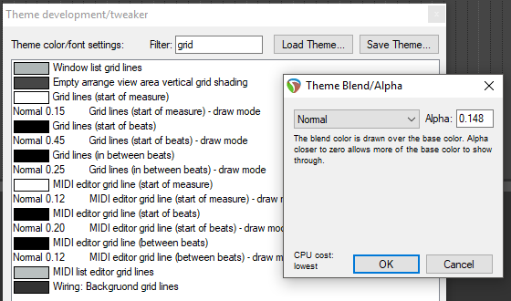
Its not the colour you want to be changing, its the alpha setting of their draw mode.
I will continue to look at this, but my target will be to make them just visible enough, or maybe just a touch more, for the majority of users.
Other software deals with the current unpredictable state of user screen brightness (where all our old assumptions are dead and the range is so huge as to be impossible to service by a single UI) by the means of an in-app brightness control. This is beyond the capabilities of the theming engine. It will be very easy to make altered-brightness mods of this theme, its beginner level stuff, so while not an ideal situation it is correct and Reaper-approriate to rely on the community to serve the outlier users' needs. The key question is to accertain how far from 'normal' we define as 'an outlier' which is one of those 'how long is a piece of string' questions that always has an unsatisfying answer.
Quote:
Originally Posted by Futur8me
Also when i choose the 150% sizing, my iMac takes half a second to scale it properly and then it is at normal size, but at 200% it does not properly size at all it just stays at the huge size.
I hope i explained that well enough, is that enough information?.
|
Not really! how are you choosing the 150% scaling? Your iMac should do that automatically. If you are using the scaling controls on the adjuster script, please not they are currently a) bad and b) broken. Also, if you are at 200% (which I imagine is correct for a 5k iMac) then note that you will only be able to scale smaller using the script, since your 'normal' size is already as big as it gets.
|
|
|
|
|
05-06-2019, 04:41 AM
|
#504
|
|
Human being with feelings
Join Date: Dec 2015
Posts: 394
|
Quote:
Originally Posted by White Tie
The theme adjuster script can only address things which are able to be controlled by WALTER - TCP, MCP, EnvCP and Transport, or other things already covered by existing scripting functionality, such as custom colors. That doesn't include a very great many things, including the arrange window.
There is no point making Reaper feature requests to me, I can't do anything about them. The developers are probably less likely to read this thread than any other, since their time is limited and they might assume its something I am dealing with.
I will not pass on feature requests. I have yet to demonstrate that I've squeezed the full value out of the new functionality we've only just got, I don't have a particularly good track record of getting my own feature requests implemented (there's no favouritism here) and I have a million of my own feature requests anyway.
|
Is this directed at me also???.., because what i have stated is an objectively verifiable fact.
In the Reaper 5 theme i can change the grid line colours and clearly see the chosen colour of the grid lines.., but in this version 6 theme i can not see the different colours of the grid lines at all, they are not seperate but blended in with the dark grey background of this new theme making up different dark coloured grid lines.
The 200% scaling does not work for me on my 5K iMac.. the 150% always takes half a second to be recognised and then the iMac puts it to normal size, and yes i am using the dev releases.
.
.
__________________
16" M1Pro MacBook Pro, 32gig ram, 1TB ssd, macOS 14
|
|
|
|
|
05-06-2019, 04:46 AM
|
#505
|
|
Pixel Pusher
Join Date: Mar 2007
Location: Blighty
Posts: 4,982
|
Quote:
Originally Posted by Futur8me
Is this directed at me also???
|
No it wasn't.
|
|
|
|
|
05-06-2019, 04:52 AM
|
#506
|
|
Human being with feelings
Join Date: Dec 2015
Posts: 394
|
Quote:
Originally Posted by White Tie
No it wasn't.
|
Cool.., so why is it that when i change the grid lines to a white to be totally seperate from the very dark background so that i can actually SEE the grid lines.., they are not white at all?.
.
__________________
16" M1Pro MacBook Pro, 32gig ram, 1TB ssd, macOS 14
|
|
|
|
|
05-06-2019, 04:55 AM
|
#507
|
|
Pixel Pusher
Join Date: Mar 2007
Location: Blighty
Posts: 4,982
|
Its not the colour you want to be changing, its the alpha setting of their draw mode.
|
|
|
|
|
05-06-2019, 05:01 AM
|
#508
|
|
Human being with feelings
Join Date: Dec 2015
Posts: 394
|
Quote:
Originally Posted by White Tie
Its not the colour you want to be changing, its the alpha setting of their draw mode.
|
wow really, ok thank you for explanation but how on earth was i suppose to know that??.
you would think that just changing the colour like you do in the V5 theme would be the logical conclusion.., but no its now the alpha setting also...???.
I am Frustrated haha.
.
.
__________________
16" M1Pro MacBook Pro, 32gig ram, 1TB ssd, macOS 14
Last edited by Futur8me; 05-06-2019 at 05:07 AM.
|
|
|
|
|
05-06-2019, 05:42 AM
|
#509
|
|
Human being with feelings
Join Date: Dec 2015
Posts: 394
|
After much confusion and not knowing what exactly to do i finally figured out that as WT explained to me, changing the Alpha blend.... to "Normal" and at 1.00, i can now finally see the grid lines colours i choose and need in order to see them clearly!.
Thanks.
I now look forward to the scaling actually working properly.
.
.
__________________
16" M1Pro MacBook Pro, 32gig ram, 1TB ssd, macOS 14
|
|
|
|
|
05-06-2019, 06:17 AM
|
#510
|
|
Human being with feelings
Join Date: Sep 2008
Location: Calgary, AB, Canada
Posts: 6,551
|
Re: the grid lines, anything finer than the Start Of Measure lines is 100% invisible on my end - not just dim, but literally not there at all. However, I noticed something that makes me think it's an issue with the conversion to Linux - opening the theme tweaker, all of them are set to Dodge with values like -1.88 (yes, with a minus) so it makes perfect sense why I wouldn't be seeing them.
This is a bug... right?
As far as other indicators like the stretch markers, your rationale really, really confuses me (it may also arouse a few other emotions that I won't list here). I get that you don't want to overload people with information, but if I put a stretch marker on an item I damn well want to be able to see that there's a stretch marker on the item - I'm genuinely curious how you decided that 211 211 211 is a good choice for text that has to be readable on top of a white background. I find it really difficult (read: will cause eye-strain) to read without maxing out the brightness on my monitor.
Something in the 90 90 90 range would still be fairly low-contrast on unselected items while standing out well on those that are selected... and I imagine selected items are where you want more information to be hitting you in the face rather than what you've got now.
Again, I understand that you're trying to err on the side of too little contrast in a lot of areas here, but it seems to me that there's something questionable in how you're deciding on the lower limit.
Last edited by Lokasenna; 05-06-2019 at 06:34 AM.
|
|
|
|
|
05-06-2019, 06:59 AM
|
#511
|
|
Pixel Pusher
Join Date: Mar 2007
Location: Blighty
Posts: 4,982
|
Quote:
Originally Posted by Lokasenna
I noticed something that makes me think it's an issue with the conversion to Linux - opening the theme tweaker, all of them are set to Dodge with values like -1.88 (yes, with a minus) so it makes perfect sense why I wouldn't be seeing them.
This is a bug... right?
|
Sounds like it, yes.
Quote:
Originally Posted by Lokasenna
(it may also arouse a few other emotions that I won't list here) - I'm genuinely curious how you decided that 211 211 211 is a good choice for text that has to be readable on top of a white background.
|
That you hadn't even considered "its alpha, he hasn't looked at that yet" would, if I were to be uncharitable, indicate you aren't actually here to help, you're just trying to catch me out and look clever.
I hope that is not the case.
|
|
|
|
|
05-06-2019, 07:00 AM
|
#512
|
|
Human being with feelings
Join Date: Dec 2015
Posts: 394
|
Lokasenna.. this is exactly the problem i had.., but on MacOS.., it was sooo confusing.., i could not see any of the grid lines at all in this new V6 theme because as you just explained the Alpha bend was at -1.88.
.
__________________
16" M1Pro MacBook Pro, 32gig ram, 1TB ssd, macOS 14
|
|
|
|
|
05-06-2019, 07:17 AM
|
#513
|
|
Human being with feelings
Join Date: Jun 2008
Location: Whales, UK
Posts: 6,010
|
Just seen this, looks interesting, will try out v soon.
completely understand reluctantly keeping it in-house as I recall the messiness of the past, an almost impossible job really.
Basics I see like the larger fx button hit area, clearer input monitoring and the context stuff would keep me happy.. Rest is decor on the tree.
|
|
|
|
|
05-06-2019, 08:08 AM
|
#514
|
|
Human being with feelings
Join Date: Jan 2016
Posts: 884
|
Quote:
Originally Posted by White Tie
That you hadn't even considered "its alpha, he hasn't looked at that yet" would, if I were to be uncharitable, indicate you aren't actually here to help, you're just trying to catch me out and look clever.
I hope that is not the case.
|
Respectfully (really), your replies on the issue of the stretch marker text not being visible... give the impression that maybe it's time you take some distance and work on the next iteration without doing the committee thing as you have emphasized yourself.
Not being able to read the stretch marker text on selected items was already specifically mentioned more than once, and instead of saying something like "no worries, I haven't looked into it yet", you said you already addressed these comments, with a link to your thoughts on the selection color and the like. For me, at least, that gave the impression you had looked into it, in a preliminary fashion. The color being at [211, 211, 211] was something I peeked at previously, also, and just went "huh" after reading that reply, fully thinking you actually had chosen it. Decided not to get involved then.
Now, after this reply, it's the opposite impression, as in - it hasn't been looked into at all. This is why I get the vibe there's some stress and unnecessary "load management" going on, and in my opinion it's better to concentrate on the task. The mixed messages and the escalatingly defensive vibe do more harm than good, in more than one sense, imho.
|
|
|
|
|
05-06-2019, 08:16 AM
|
#515
|
|
Human being with feelings
Join Date: Sep 2008
Location: Calgary, AB, Canada
Posts: 6,551
|
Quote:
Originally Posted by White Tie
That you hadn't even considered "its alpha, he hasn't looked at that yet" would, if I were to be uncharitable, indicate you aren't actually here to help, you're just trying to catch me out and look clever.
|
You're right that I hadn't considered it, because you keep telling us that the design is essentially final, you have reasons for doing what you're doing, we're not designing by committee, etc.
You've also specifically disagreed with comments about contrast in other parts of the theme so, far all I know, this might be working as intended. Your OP has a short list of outstanding problems but this isn't on it.
It's very unclear to me what constitutes a valid issue here and what doesn't.
At this point, given the details I've tried to provide and the existence of Nitpicky, I would hope it's clear that I want the theme to be the best it can be. You and I obviously disagree in a few places as to what "best" looks like, which is why I've tried to be as specific with my various criticisms as possible.
Last edited by Lokasenna; 05-06-2019 at 08:25 AM.
|
|
|
|
|
05-06-2019, 08:56 AM
|
#516
|
|
Human being with feelings
Join Date: Sep 2009
Posts: 863
|
Quote:
Originally Posted by White Tie
It would be madness this early on to just revert to the old ME and call it done, that seems terribly defeatist, but its very tempting |
100% batshitloco but, considering that you appear to be under some fairly heavy, sustained friendly fire, and given the shifting foundations of the ME, I wouldn't blame you. Onwards and upwards though, eh?
|
|
|
|
|
05-06-2019, 09:42 AM
|
#517
|
|
Pixel Pusher
Join Date: Mar 2007
Location: Blighty
Posts: 4,982
|
Quote:
Originally Posted by Lunar Ladder
The mixed messages and the escalatingly defensive vibe
|
I'm afraid we always have to go through this stage. Every time.
Quote:
Originally Posted by Lokasenna
It's very unclear to me what constitutes a valid issue here and what doesn't.
|
Yes, its tricky. But if you find yourself coming from a position that I'm a bad designer / malicious / not listening / doing what I want, then experience has shown that it doesn't actually matter; we're simply never going to be able to have an effective design relationship anyway.
|
|
|
|
|
05-06-2019, 10:16 AM
|
#518
|
|
Mortal
Join Date: Jan 2006
Location: Wickenburg, Arizona
Posts: 14,051
|
Quote:
Originally Posted by White Tie
|
I think you linked the wrong post. But if you have ideas to fix that's awesome and thats all I'm really worried about, the rest of the theme is incredible!
|
|
|
|
|
05-06-2019, 10:26 AM
|
#519
|
|
Pixel Pusher
Join Date: Mar 2007
Location: Blighty
Posts: 4,982
|
No, that is the right post. TL/DR selected status is very preliminary, so anything relating to selected status is essentially a shrug for now.
|
|
|
|
|
05-06-2019, 10:32 AM
|
#520
|
|
Human being with feelings
Join Date: Sep 2008
Location: Calgary, AB, Canada
Posts: 6,551
|
Quote:
Originally Posted by White Tie
But if you find yourself coming from a position that I'm a bad designer / malicious / not listening / doing what I want, then experience has shown that it doesn't actually matter
|
I wouldn't agree with any of those. IMO it's poor communication, probably on both sides.
However, specific to "not listening" and the issue I've been harping on about :
When a number of people raise a significant, unable-to-use-the-theme functionality issue, and your response is effectively "it's that way on purpose and my testers were fine with it", what message do you think that sends?
A page or two back I suggested that any theme for general users, and *especially* the default theme, should err on the side of being too accessible. Do you disagree? If so, I'm curious why.
I realize you're busy and this thread is incredibly noisy, so I'm happy to continue this in PMs if you'd prefer. Or not.
|
|
|
|
| Thread Tools |
|
|
| Display Modes |
 Linear Mode Linear Mode
|
 Posting Rules
|
You may not post new threads
You may not post replies
You may not post attachments
You may not edit your posts
HTML code is Off
|
|
|
All times are GMT -7. The time now is 08:56 PM.
|


